Chapelwood is a large church community offering services, events, and resources for a diverse audience. The website serves as a central hub for members, visitors, and new attendees looking for information, connection, and engagement.
The goal of this project was to redesign the website to improve usability, simplify navigation, and create a more welcoming and accessible experience for both new and existing users.
Role & Duration
Lead UX Designer & Consultant
Research, Wireframing, Visual Design, WordPress Development
Ongoing Project
KPI Improvements
Monthly Visitors
+0K
Organic Traffic
+0K
Monthly Subs
+0K
The Problem
User Experience
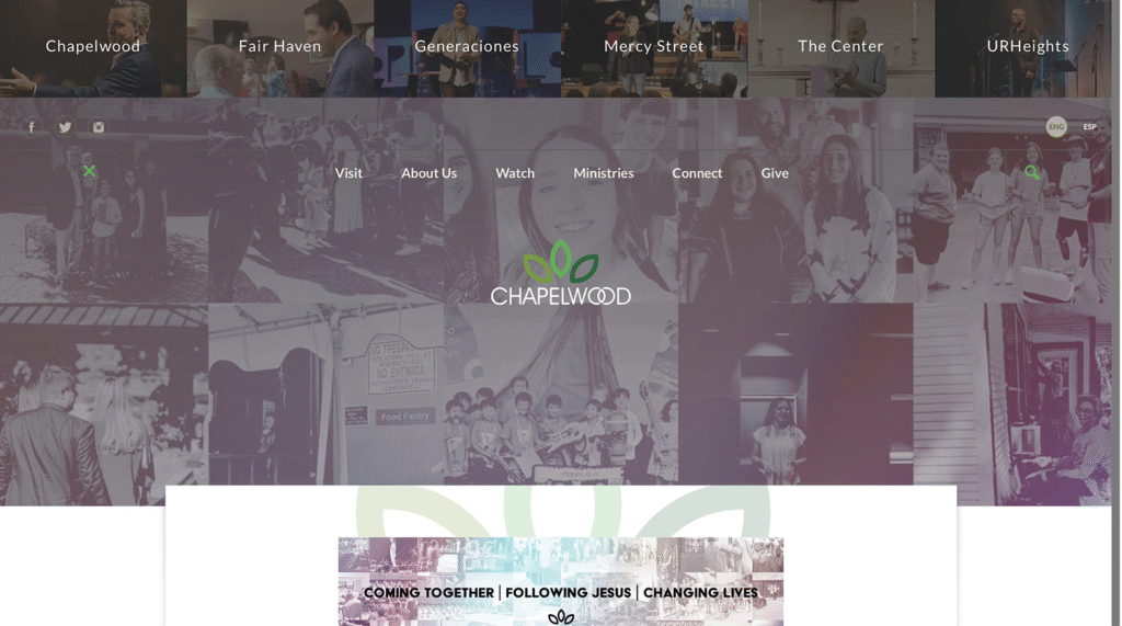
The existing website was outdated, difficult to navigate, and did not clearly communicate the church’s offerings or community experience.
Users struggled to find service times and key information
Navigation was overwhelming and unclear
Content was difficult to scan and understand
The site did not effectively guide new visitors
First Impressions & Insights
Analysis of the existing website revealed:
Inefficient information architecture
Overloaded navigation with too many options
Lack of clear entry points for new visitors
Inconsistent layout and visual hierarchy
Key actions (visit, watch, connect) were not emphasized
Church websites must prioritize clarity and accessibility, especially for first-time visitors who are unfamiliar with the organization.
Strategy & Approach
An Accessible Website for a Multi-Generational Community
Why: Understand how new and existing users interact with church websites
How: Simplify navigation, restructure content, and improve accessibility
What: Design a website that clearly communicates services, events, and ways to connect
A New Generation
The strategy focused on balancing tradition with growth. Established in 1948, Chapelwood has a strong base of long-time members, many of whom rely on familiarity and ease of use when navigating digital platforms. At the same time, new leadership aimed to attract younger families and create a more modern, inviting entry point through the website. To support both audiences, the design approach prioritized accessibility and simplicity—using clear navigation, intuitive UI patterns, and highly legible content to ensure the experience feels effortless for all users. This balance allowed the website to remain approachable for existing members while becoming more engaging and welcoming to a new generation.
Wireframes & Conceptual Design
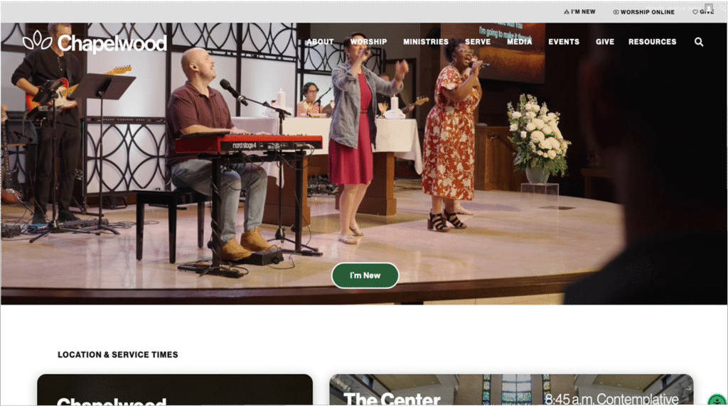
Homepage redesigned to highlight key actions (visit, watch, connect)
Navigation simplified to reduce overwhelm
Events and service information made more accessible
Content structured to guide users naturally through the site
Visual Design
Clear Brand Clear Navigation
Clean, modern typography focused on readability
Increased white space for clarity
Stronger hierarchy to guide user attention
Warm, welcoming visual tone aligned with the brand
Consistent design system across pages
The Solution
The redesigned website provides:
Clear access to service times and location information
Simplified navigation and user flow
Stronger emphasis on key actions (visit, watch, connect)
A modern and welcoming visual experience
Better structure for events and community engagement
Before & After
Before
Click to view the old website
After
Click to view the new website
Impact
Seamless Community Integration
Improved usability and navigation
Stronger first impression for new visitors
Increased clarity around services and events
More engaging and accessible user experience
Better alignment with the church’s community-focused mission
What I Learned
Designing for diverse audiences requires strong clarity and structure
Accessibility and readability are critical for engagement
Clear navigation is essential for first-time users
Simplicity improves both usability and overall experience
Other Projects
Shine Franchising
A full UX/UI redesign focused on improving clarity, strengthening trust, and guiding potential franchise owners through the decision-making process.
C4 Imaging
Data-driven website redesign to improve user engagement, accessibility, and competitive positioning for a medical technology company.
Geti in Touch
Want to work on something together? Just want to chat? Hit me up.