C4 Imaging creates advanced MRI markers for image-guided cancer therapy. Their website needed to communicate complex medical technology clearly, build credibility with hospitals and doctors, and outperform competitors like Gold Anchor.
The project aimed to combine user-focused design with data-driven insights, ensuring the website not only looked professional but converted effectively and supported business goals.
Role & Duration
Lead UX Designer / Web Developer
User Research, Interaction, Visual design, Prototyping & WordPress Dev
6 Months – October 2025
KPI Improvements
Unique Visitors
+0%
Mobile users
+0%
Daily Visitors
+0K
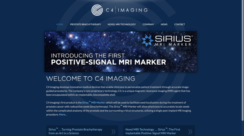
The Problem
User Experience
The existing website was outdated, difficult to navigate, and did not clearly explain the products or their benefits.
Users struggled to find relevant product information quickly
Visual hierarchy and IA were inefficient
Accessibility and usability issues reduced engagement
The board was hesitant to approve a rebuild without clear evidence of impact
First Impressions & Insights
Analysis of the C4 website revealed:
Inefficient information architecture
Lack of user-friendliness
Violations of visual proximity principles
Inaccessible color choices
Weak SEO practices and meta descriptions
Competitive analysis vs Gold Anchor showed that C4’s visual language and IA were behind industry standards, highlighting the need for a redesign.
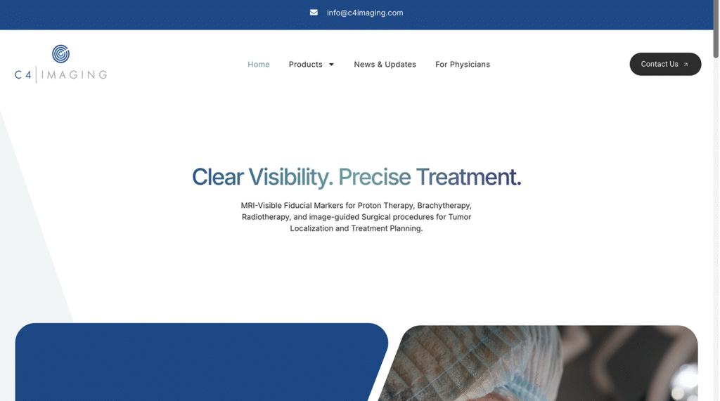
Before & After
Strategy & Approach
Understanding the Market
Why: Understand user needs and first impressions
How: Research competitors, analyze content, and improve IA
What: Design a website that clearly communicates C4’s technology, builds trust, and guides users toward action
Improving IA
The design direction focused on modernizing the website while improving clarity and long-term scalability. The updated interface uses softer rounded elements and a cleaner layout to reflect a more current 2026 web standard, helping the brand feel more advanced and trustworthy. Typography played a major role in this approach, so the type system was built around Inter to maximize readability across both desktop and mobile while keeping the design scalable for future content. The layout also prioritizes strong branding with intentional white space, allowing key information to stand out without overwhelming the user. Rather than overloading pages with technical details, the main content is structured to stay clear and easy to scan, while more in-depth information is available through longer resources and the document library for users who want to explore further.
Wireframes & Conceptual Design
Homepage layout prioritizes clarity and first impressions
Product pages redesigned for scan-friendly information hierarchy
Navigation simplified to reduce cognitive load
Content structured for readability and trust
Visual Design
Creating Trust & Intrigue
Clean, professional typography
Clinical, trustworthy color palette
Increased white space for readability
Accessible contrast and improved usability
The Solution
The redesigned website provides:
Clear, concise product messaging
Simplified navigation for doctors and hospital staff
Modern, professional visual identity
Scalable content structure for future products
Before & After
Before
Click to view the old website
After
Click to view the new website
Impact
Real Numbers Real Results
Demonstrated measurable business value of UX
Strengthened competitive positioning vs Gold Anchor
Improved clarity, trust, and accessibility
Set foundation for future website performance and KPIs
What I Learned
Designing for real business impact requires data + UX
Simplifying technical medical information for diverse users
Benchmarking competitors to guide strategy
Linking design decisions to measurable ROI
Other Projects
Shine Franchising
A full UX/UI redesign focused on improving clarity, strengthening trust, and guiding potential franchise owners through the decision-making process.
Chapelwood Church
Designing a website that improves clarity, accessibility, and engagement for a modern church community.
Geti in Touch
Want to work on something together? Just want to chat? Hit me up.